UX Design In a Nutshell. Why Do You Need It For Your Magento Shop?
Guest post by NEKLO
You won’t find difficult terms and buzzwords in this article - you will find how to make your online shop more attractive for visitors. Shop owners make an enormous amount of mistakes of any kind. Sometimes they are obvious, sometimes they are not. Here you will discover the list of things to pay attention to and learn how to turn design mistakes into customer magnets.
What is a UX design at all and what constituents of UX you should consider to increase your sales?
UX Design
First of all, what is User Experience Design? It is the process of user cooperation with your website when he or she receives satisfying experience. It involves the whole process of design from different sides, including branding, marketing, usability (make sure a user will experience no problems with your website), and accessibility (let people with reduced capabilities could use your shop). To put it simply, UX design must assure that your users like your website.
The point is that UX designer must be proficient in a number of different spheres: information architecture, visual design, interaction design, etc. But don’t be afraid of all these knowledge one should possess. Here you will find tips on how to improve your client interrogation.
Constituents of UX you should consider
Don’t place Beauty above Usability
Motley visual design will definitely help you drag visitors to your website, but will they stay there and buy something? If they couldn’t find the issue they were looking for because of too complicated design solutions, then the answer is “No”.

Definitely not the best design ever. Source: www.lingscars.com
Your pages shouldn’t be a challenge for users’ minds - people must clearly understand the intention of every button and where it can lead them. Remember also that overwhelmed pages not only load longer, but also distract people from finding things they really need. In particular, it applies to the Homepage. Check how Basecamp dealt with it bellow.

How Basecamp promises to tackle a business fire.
This is a page with clear Call-to-Action (talk about it later) and laconic description of what company does. The “Free trial” button here appears to be the Call-to-Action and Basecamp did their best to make all visitors see it. The color of the button stands out against a white background and also “Try it FREE” on the top-right corner leads to the same page as the “Start a free 30-day trial” button down the page. It makes users two times more likely to click it.
Still, the thing is not only about optimizing your Homepage. Other sides also require your attention. Here is the list with some of them:
a. Search is important
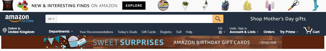
The Search line on Amazon.
Search is a thing that helps your visitors reduce all the navigation process and find the page or the product they were looking for. Nearly half of all the common visitors use the Search line instead of tabs and your browsing features. For that purpose, it is vital to take care of the Search line. It must be on all the pages, moreover, it must be visible. Also, your Search must really search through all the website and not just through some categories.
b. Make a Sitemap

Bank of America’s site map.
Some users prefer to see the list with all pages of your website and then choose the one that matches their requirements. Like the Search, the Site map serves to reduce the way of your visitors, so the link to it should also be set on every page.
c. Improve the speed

Nobody likes to wait. A visitor can close the page of one shop because of a long loading and find another one within less than a minute. So you must ensure that your website works fast enough not to make the users wait. As we remember, overwhelmed pages with lots of heavy pictures may load slower, so pay attention to it in the first place. Then check your server. Sometimes a shop owner may have troubles with it without even knowing. The question of accessibility must be reviewed from many sides.
To check the speed of your website you may use the Google’s PageSpeed Insights.
Error messages: how to lower your own expenses and calm your clients
Many people underestimate the importance of Error messages. Windows with just “Unknown error. Please, try later.” provide visitors with no information and only scares people. In fact, it also leads to the losses of the shop owner due to customer attrition. What can you do to improve the situation?

A great error with great description.
At first, you must understand, how a good error message may be profitable. It will help you by:
-
Making your visitors stay on your website and use alternative ways to do what they wanted
-
Retaining credibility among customers
-
Teaching users how to use your service
-
Releasing the overloaded technical support
Now let’s imagine that there is an error and some features or even the whole website is unavailable. Firstly, set the time when you believe the error will be fixed. Most of the users don’t understand the scales and keep calling technical support for answers. The time frames will help users understand when the crisis must end and leave the technical support alone.
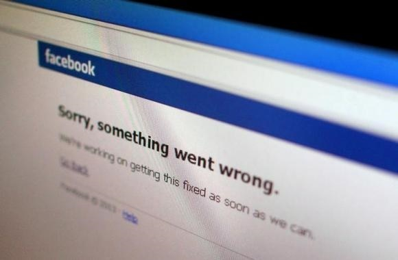
“As soon as we can” is a bad issue.
If the failure is global, then point out, what services are available. Users mustn’t search it by themselves - show them and tell them what is working and how. If the whole website is down, then figure out the reason and report about it. Your users must know the reason or you will get masses of negative feedback from those, who didn’t sort the situation.

At least they provide the full information about it.
Now let’s examine errors when the user did something wrong. Don’t think that it is only users’ fault - sometimes it is the point of the website that causes problems among a wide range of users. The most frequent error place is the Log In page.
Have you faced the situation when you couldn’t log in, reentered your password for several times, and then find out that the problem was in your email or username? This is the problem of many websites. Facebook considered it and made a form that helps users to find the mistake. It looks through the email bases and find the matching one. If it doesn’t - then you must have misprinted somewhere.
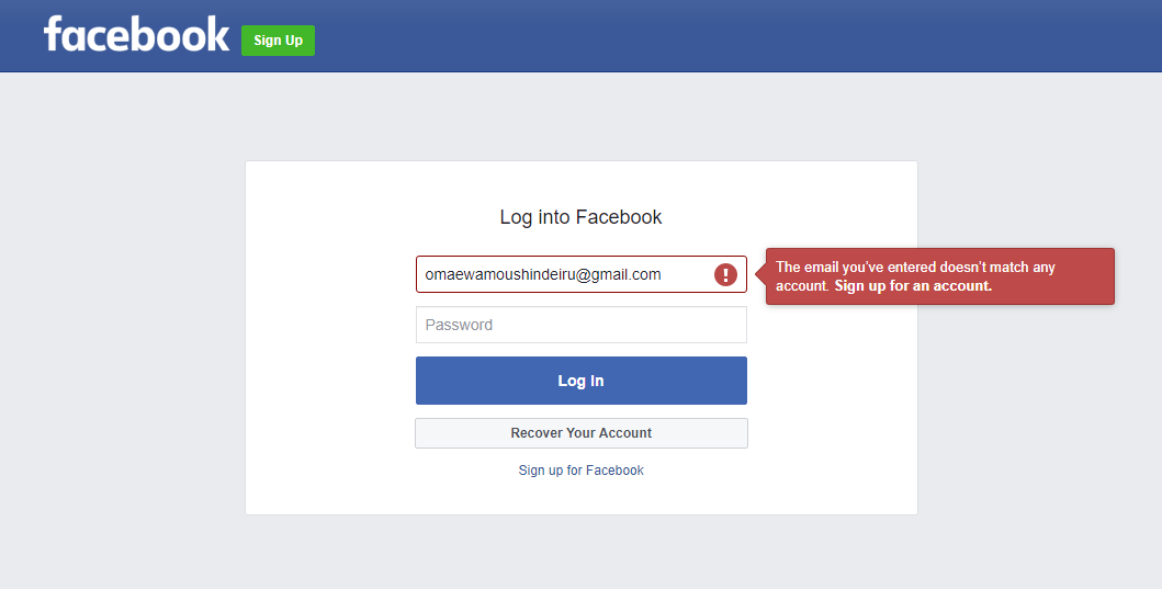
The way Facebook helps users with their mistakes.
The policy of pointing out what is particularly wrong is applicable to other user mistakes. Just show them how to solve their issue and you will teach them to interrogate with your website. The user-friendliness will help you receive new customers.
Page 404 must not be scary
The 404 page is always associated with something unpleasant. It is not surprising - this page means the dead end. The user can’t find here anything and it leads nowhere. Many shop owners consider this page to be unimportant. But even the 404 can convert your traffic if used properly.
For example, why not to add a bit of humor in it? It will set your user in a good mood and this is always a good sign. Why not entertain your users a bit?

Come on, everyone likes these guys! The LEGO Company knows it.
You may also use Page 404 in a more proficient way. For example, why not to put there a product of yours? ModCloth did this - they just offer you something on the 404 page.

How ModCloth made even their page 404 profitable.
Despite the design or idea you have chosen for this page, it is vital to offer your user ways to exit this dead-end scenario. For example, give him or her links to the Homepage of at least put a “Go back” button. DropBox did the wonderful job about it.

Navigation on the 404 page of DropBox.
Do not blindly follow the clients' comments
It may seem senseless, but actually, it makes sense. Imagine the following situation: a woman walks into a cosmetics shop when suddenly she understands she strongly wants some ice cream. It is obvious that this woman would like an ice cream stand to appear right in the store and maybe she would say it to the manager. Why not to your idea?

Still, sometimes ice cream and makeup work perfectly together.
The truth is that there are few people, who will buy ice cream in the cosmetics store. So, installation of this stand will be pointless, if not loss-making. That is why the shop owner should consider every idea and test it beforehand, brushing aside all the irrelevant and strange thoughts. For example, it is better to set a stand with makeup trial. It would be more efficient, but again one should test it before setup.
Following the eye: F- and Z-patterns
F-pattern
“F is for fast”. This is how this pattern may be described. This model is the most common one when we speak about blocks of content, textual in particular. It is called so because the movement of the eyes resembles the letter F:
-
Primarily users make the first horizontal eye movement in the upper part of the content block and read everything in it.
-
Then they lower a bit on the vertical left side and again make another horizontal movement, somewhat shorter than the previous one.
-
Finally, they only scan the left side until they find something interesting that drags their attention and makes them read horizontally again.

The F-pattern on the Chinese website.
Considering this pattern, you can organize your content in a hierarchical order, putting the most weighty and important information on the top. F-pattern is the best choice for websites with a focus on textual content. In order to help people in reading your website just set the content according to the natural scanning form. This will make your visitors read more and introduce all your goods to them.
The example of the website using this pattern is thejoint.com

A nice text hierarchy on The Joint.
Z-pattern
Another movement type is the Z-pattern. Continuing the alphabetical analogy, this type follows the letter Z. The pattern works perfectly with web pages containing little text information. So, if your website is made in a minimalistic simple design, then this pattern suits you best. The scheme of it is as follows:
-
At first, a user draws a horizontal line right on the top of the content block and reads the information on it.
-
Then he or she goes down, making a diagonal line from right to left.
-
The whole process is repeated again.
Schematically it looks like this:

A scheme of the Z-pattern.
There may be several “Z”s on the page if you organize your content the way users find interesting. How to do it? Simple enough - just impose the letter Z and put the most important information on the horizontal lines. The diagonal in its turn must contain simple and non-binding information like an image.
An example of the Z-pattern website is missionbicycle.com

Simply put Z-pattern on Mission Bicycle.
“Call-to-Action” must call to an action
What is Call-to-Action? It is a button or a sentence that persuades users to perform a particular action: to buy a product, to sign up, read a specific article. In order to make people interested in pressing this button, you should be creative. Think about what users may like and use it.
For example, take Dollar Shave Club. The first thing you see on their website is the key phrase that fully describes what they do and what you will get as a client. They hit the target - who doesn’t want to look, feel, and smell great? And these guys promise to help you in achieving that. “Get Started” instead of, for example, “Join” sounds less categorical and just offers you to try their product. Add here quite surrealistic add you will get a perfect complex Call-to-Action.

Hills of Shave Butter in the Dollar Shave Club commercial.
Besides, you should highlight all the Call-to-Action buttons in order to make your visitors see them. Look how “Get Started” stands out on the example above. This button along with “Add to Cart” and “Sign Up” must be the most prominent things on the page. Moreover, it would be better to set these buttons on every page of your website.
Intrusive pop-ups lead to losses
Pop-ups are a great thing. They provide users with necessary or interesting information without occupying space on the page. Or they offer additional features to the client. But in spite of how great your pop-ups are if they are intrusive their effect will be opposite. No one likes extreme pushiness. Pop-ups should delicately offer your clients something and not disturb them. A huge pop up in the middle of the screen will definitely draw attention, but this attention is unlikely to be positive.

Not quite the thing I was looking for.
Think about what your users would like to see and give them this information without interrupting their browsing. Just make a small pop up on the side of the screen. It will bring more effect and won’t be closed immediately after appearing.
The arrangement of goods must work for you
Product segregation gives your clients more possibilities to find the suitable goods for them. Nobody wants to spend time searching through dozens of products he or she is not interested in. It is better to arrange goods in a particular order, set filters, and check the advantages of this or that product.
A nice segregation will give you full control of users’ attention. Just show your clients the products they may like. For this purpose, you may use the Visual Product Sorting by Drag and Drop plugin for your shop.

What is the better way to show products than pictures?
Grenson deals with it great. They set the images of goods on their homepage, so as visitors could choose the shoes or accessories they like without even knowing the name of it. A list of filters is icing on the cake.
Use color schemes and fonts to delight your visitor’s eye
The color palette is much more important than one may think. Colors influence our brain causing various effects. So, the right palette will set your visitors in a mood you wanted and incline them to buy. Consider your website focus and choose colors according to it.
The same is with fonts. For example, classical Times New Roman will perfectly match a business-oriented shop, like Parker. But Comic Sans, in this case, will ruin all the visitors' impression and may even scare away the clients.

Imagine this text to be written in Comic Sans. Parker won’t be such a respectable company in that case.
Also, do not forget about people with eye problems and color-blinded users. If it is possible - create separate variants of your pages to help these people. The thing that you take care alone will raise your credibility among clients. And you will also receive more customers. Accessibility is a great issue.
Summarizing the talk
Every shop owner should worry about his clients. That is why User Experience has such a great importance. Now let’s recollect all the tips:
-
Usability is over Beauty
-
Spend time on making productive Error messages
-
Create useful Page 404
-
Do not blindly follow your customers’ comments
-
Remember about Z- and F-patterns
-
Call-to-Action must do its job
-
Do not make intrusive pop-ups
-
Product segregation will help your users to find suitable goods
-
Colors and fonts must reflect the website focus
Keeping these points in mind, you will make your shop more convenient for users. Remember about it, as shops that are difficult to use (even with great graphic design) can’t attract clients and, as a result, won’t be profitable at all.


Newsletter